
The Color Wheel Company
Honest Reviews for Every Roller
Color Wheel
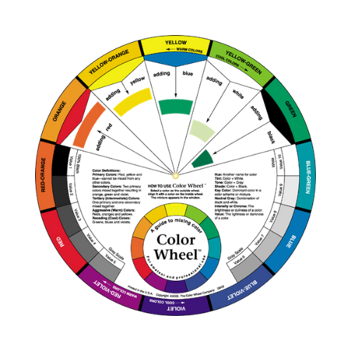
Working in residential homes, I’ve learned that most color mistakes come from not fully understanding how colors relate to each other. Homeowners often pick a shade they like, but they don’t always see the undertone, the temperature shift, or how it reacts to the other colors already in the room. The Color Wheel Company’s tools have become one of the simplest ways to explain those relationships clearly, right on site.
Their wheels come in practical sizes — smaller 5–6 inch versions that fit easily in a pouch or pocket, and larger 9–10 inch wheels that give clients a bigger visual reference when we’re planning a palette. Both sizes rotate smoothly and lay out primaries, secondaries, and tertiaries in a way that makes sense even to clients who don’t speak “color theory.”
What I appreciate most is how quickly these wheels help homeowners understand undertones. When someone is debating between two off‑whites or trying to figure out why a beige looks pink in their hallway, I can point to the wheel and show exactly where that undertone comes from. It cuts down on confusion and helps clients make decisions with more confidence.
The wheels also make it easier to build harmonious palettes. Whether I’m matching a wall color to existing trim, balancing warm and cool tones in an open‑concept space, or helping a client avoid clashing accent colors, the wheel gives a clear visual guide. It’s a simple tool, but it saves time and prevents a lot of second‑guessing.
For homeowners who struggle to visualize how colors interact, these wheels are a reliable teaching tool. For painters, they’re a quick reference that keeps color conversations grounded and accurate. I use them in consultations, during quotes, and even when reviewing color options before a job starts. They’re durable, easy to read, and practical in both small and large formats.
Overall, The Color Wheel Company’s color wheels have become a steady part of my residential workflow. They help clients understand color relationships, reduce miscommunication, and make the entire selection process smoother from start to finish. They’re not a replacement for professional advice, but they’re one of the best visual aids for getting everyone aligned before the first coat goes on.